Sunday, 30 November 2014

It's Just A Spark

Due to unfortunate timings we missed our opportunity to film with another bonfire. We had only needed it for small shots. 
The first idea was for our main character to burn her memories in the fire to start again, instead I put forward the idea of her setting the photographs on fire with a lighter or match.
  Helen was really excited for this idea as we could cut into the small flame with HD cameras and make create a nice visual effect. 
The second idea was to take a photo of the band in front of the bonfire so she could it on her blank wall to signify a new beginning.
 I thought we could possibly take the photo of the band while they are doing the cut away of the live performance, to show they were last hope all along.

These are just Plan B's in case our original ideas don't work out because of time.

Friday, 28 November 2014

Magazine Advert Feedback

I asked a 15 year old boy what he thought of our magazine advert. He said he really liked the bright colours on the black background and that it stood out. Although I didn't mention what this was for, he did say that he didn't know what the purpose of this was for. We must add more conventions for our actual one.

I also asked an 18 year old girl what her opinions were. She liked the binary opposition of the white-on-black and how the tip of the bonfire is going into the 'HOPE'. She said it was a positive that the band look really comfortable as friends and not only as a band. What she didn't like was that the image of the band was clearly placed in because the photo of them would be lightened up by the bonfire behind. So when we go onto location to take the photos we must make sure that the lighting is natural.

Editing Part 2

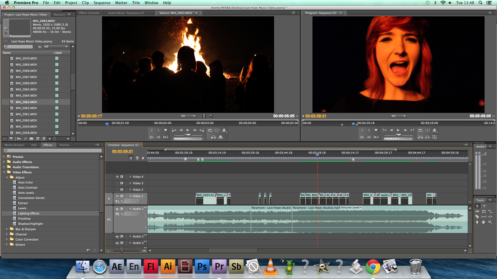
During this editing process we've becoming happy with what we have so far. However we have had a  few differences in where we would like to place certain clips, and what we thought worked but can make it better.


For example, yesterday we decided to remove 3 clips of the crowd clapping as we thought it would become too much and tedious. We decided to leave 3 there and cut in band scenes in between.


Earlier on while editing, after having placed a clip called 'walking to the back', we agreed that it would be more effective to move it to when the bonfire scenes were coming to a close. She will mix into the crowd.


Digipak & Magazine Draft


I did some research into the design of magazine adverts to see what conventions they have in common. Above are my favourite two from two different genres.
We have also design a basic idea of what our magazine advert will be like, using pictures from Google images:

In the process of adding the actual photo of Paramore I discovered a technique of fading and hardening the picture as you can see from the draft on the right. My favourite part of this is the title and the subheading, although it is quite formal I do feel that it stands out and is clear. It's white on a black background so that links with the 'light in the dark' aspect that we are trying to create.

Monday, 24 November 2014

Actor Profiles

Keira
This is my friend Keira. I think she is perfect for the lead role in our music video because of her natural sense of style and her love of music. She has a real, out-going personality, like the character we are trying to portray in our video.

Janet
Janet is our bassist. She has great fashion sense and isn't afraid to rock out. She has the same taste in music and enjoys listening to bands like Paramore and similar. Janet feels that the lyrics are relatable.


Rosie
Rosie is our lead guitarist. She genuinely plays guitar and has a  very out going personality, the kind a lead guitarist would have. She is open to all genres of music including rock, pop and rap.

Lissie
This is our drummer Lissie. Admittedly, she wasn't our first choice in drummers, due to our first choice, Luisa, becoming injured. Lissie has become our drummer, She also has a very rock 'n' roll style and loves rock music.


All of our actors love this genre of music, and appreciate the art that is live music. In these cutaways this is what we are trying to create with the lighting and the active band members. And as the video cuts between a crowd in a field, and then back to them in the studio, I think the real meaning of the song shows. It shows where your roots lie.


Speed/Duration


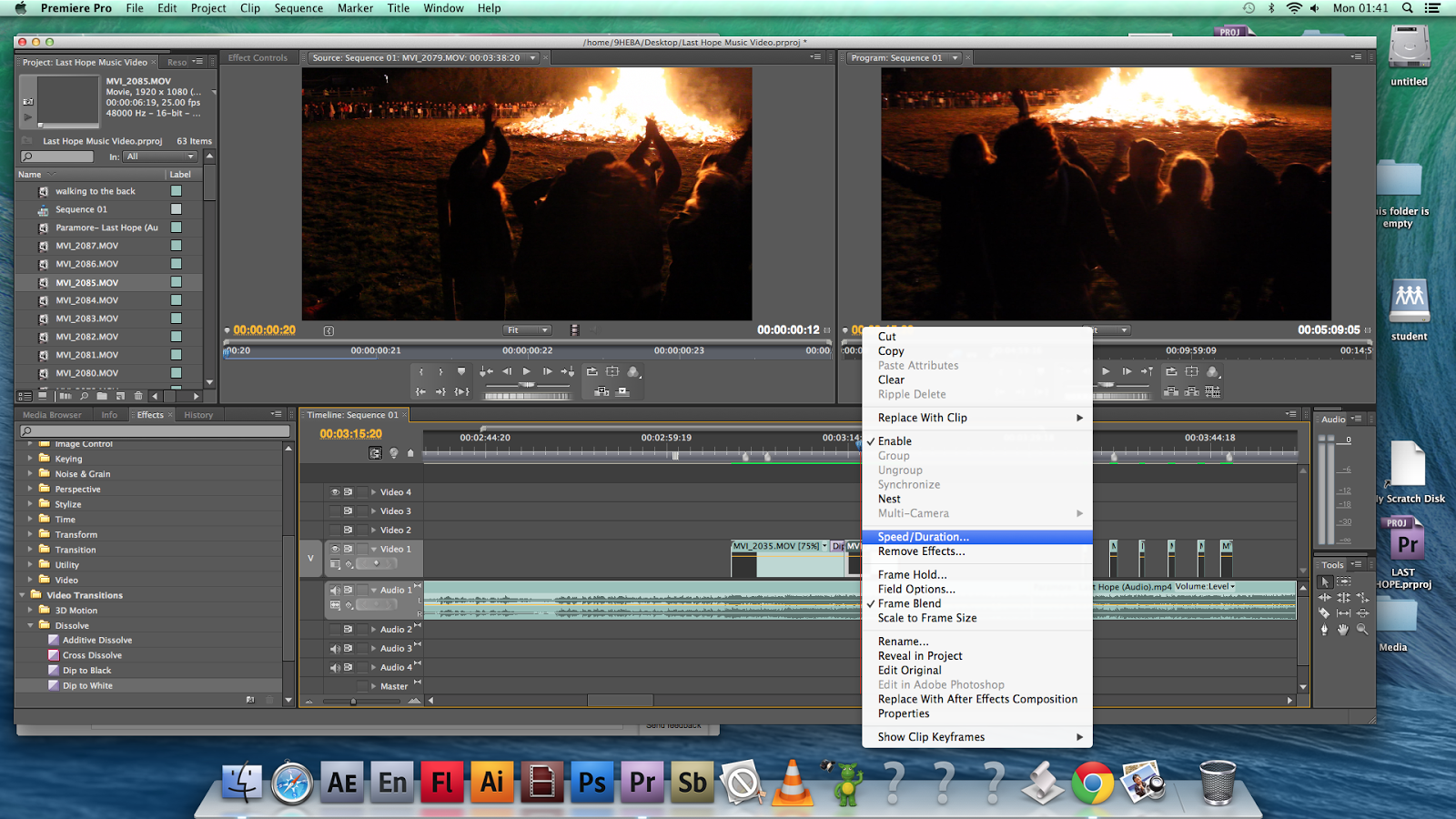
Today I learnt how to to speed and slow down footage by pressing CTRL and selecting 'Speed/Duration'. This is a really useful technique and adds more emphasis and depth. By slowing clips down we can draw more focus into specific parts.

Friday, 21 November 2014

Costume and Style

We have taken inspiration for Paramore's Hayley Williams for style in this music video. Most of the time her fashion sense is quite basic rock and roll but easy to replicate. Keira, who plays our main girl, also had dyed reddish hair and a septum piercing, similar to Hayley which I think is a useful feature and adds familiarity. Costume for our main character is sorted.

Style Inspiration from Hayley Williams on PhotoPeach

Tuesday, 18 November 2014

Editing Part 1


The editing process has begun and so far we have put together around thirty seconds of footage including transitions to add fluency.
If there's one thing that is especially going well it is timings. There is a point in the song where people in the background clap and we were able to capture footage of this and put it at the perfect moment in the song. This creates impact.
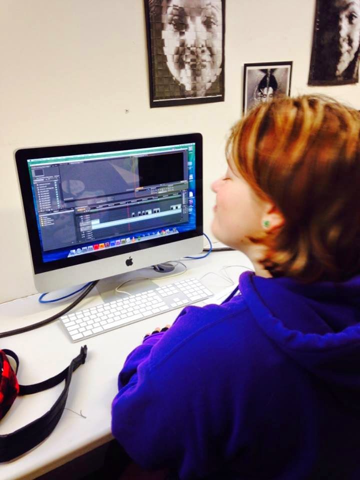
Personally I'm not used to using Premier Pro, instead I feel more comfortable with programmes like iMovie. This has been a learning experience for me when using a different software and so far I'm enjoying playing around with it.


I've also started to show people the edited footage we have so far. I've been given really positive feedback regarding the shots and lighting. I want to show it to a few males too, just to see if the video still appeals to both genders of the same age.


Tuesday, 11 November 2014

5th of November Storyboard


We're not the best of artist, but we found this incredibly helpful to plan and make our work happen.
From the images below you can see we've manage to get the shots we were hoping for and were able to get that 'mix'.

I'm really pleased with how it turned out. I honestly didn't have high expectations from what we gathered of the practice shoot because of the camera quality and lighting

It's what I wished for and more.


Wednesday, 5 November 2014

DIY Lighting

Tonight we filmed at the bonfire. We were faced with the problem of our lack of lighting (other than the bonfire). We couldn't see faces clearly. So we came up with a solution:

We taped tin foil to a flattened cardboard box and held it so the foil was facing the direction of our main character. The light from the bonfire would hit the board and reflect on our actors.
From the video below you can see that this was very effective.

Tuesday, 4 November 2014

Storyboarding

Storyboards are graphic organizers, a form of pre-visualising content using illustrations and/or images.

By recording information in detail on the storyboard, it's easy to communicate the type of shot, action, editing and also give advice to the actors to perfect the shot.

It's helpful to use storyboards as a checklist, and cross of all the shots filmed.

Alfred Hitchcock is a fine example of directors using storyboards for professional films. Click the photo below to see scenes and their storyboards from some of his different films.

Monday, 3 November 2014

Risk Assessment

I made a video showing an animated version of our risk assessment. BONFIRE by 9mawj on GoAnimate

Sunday, 2 November 2014

Work

Jimmy Eat World's 'Work' video contains an initial idea that we had. At the beginning is a vox pop of students talking of work and school, something incredibly relevant to the video.
We think it would be powerful to have a vox pop of our target audience's age to speak of what makes them happy and edit it so that we see it before we go into the music video.

Practice Run

On the 2nd of November, Helen and I contacted a friend of our who was willing to be in a practice video, in preparation for the 5th, our actual shoot.
We didn't have any sufficient lighting, a tripod that couldn't pan and a half-finished storyboard.
Here's the result


We know for next time to bring lighting, a flexible tripod and a completed storyboard. Besides the faults, if we hadn't have done this we wouldn't be so prepared for the 5th in front of the bonfire.